Published
May 30, 2011
May 30, 2011
Mango renews its image with a new logo
Published
May 30, 2011
May 30, 2011
Spanish apparel retailer Mango has renewed its image with a new logo. This is one of the many other changes made by the company in recent times, such as changes to the collections and advertising, as well as the opening of new stores. Mango is nwo also in the process of revising the company's image, all in the aim to appeal to a more mature female customer.
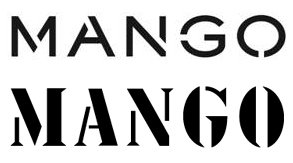
 Mango's new logo (above), compared to the old one (below) |
The company, which has continued to adapt its logo in according to its own requirements and trends since it was founded in 1984, has on this occasion gone for a cleaner and simpler type face, while maintaining the DNA of the brand at all times. This new logo represents the values of the brand, such as its unique style, originality and femininity, and is adapted to the style of the Mango woman of today.
In order for it to endure over time and not suffer changes in fashion, Mango has taken the most illustrative aspects of the former logo, based on mecano parts and in which the "o", for example, was similar to a screw head, taking as a reference a simple, discreet and solid type face. This new graphic image, which has already been used in brand’s fashion show in Paris, will gradually be incorporated in all the brand’s materials.
Mango, which opened its first store in Barcelona’s Passeig de Gràcia in 1984, now has over 2,000 stores in 105 countries. It is Spain’s second biggest fashion export company and its concept is based on an alliance between a quality product, in accordance with the latest fashion trends, and an affordable price.
Copyright © 2024 FashionNetwork.com All rights reserved.


